Usability and Security – Is a tradeoff necessary?
Usability is one of the main reasons for a successful software with user interaction. But often it is worsened by high security standards. Furthermore many use cases need authentication, authorisation and system access where high damage is risked when security possibilities get reduced. In this article the dependence of these two areas as well as typical mistakes with their possible solutions are shown to bury a fallacy in IT: “There needs to be a tradeoff between security and usability”.
“Too secure” services
“… security is only as good as it’s weakest link, and people are the weakest link in the chain.’” – Bruce Schneier
Security can depend on usability. Especially in enterprise context. To make an environment as secure as possible very strict guidelines are introduced: e.g. at least 13 characters, two special characters, three numbers, large and lower case characters, password needs to be changed every month, every access needs different passwords, new passwords may not be too similar to old one etc. Sure, no bruteforce attack could never crack such passwords and hackers will also have their difficulties but what most admins establishing these rules are not aware of, are users trying to bypass these security measurements.
The typical non-IT user is not aware of security threats and tries to get his work done as easy and fast as possible. Such high password guidelines will not just make users angry, they could start writing their passwords on notes that are on their monitors due to difficulties to remember these informations. When passwords need to be changed every month users start using patterns not to forget their passwords. A friend who was system administrator told me of employees talking about such patterns. They had to change their password every quarter and used the season with year: Spring2017, Summer2017, etc. to remember them.
Fortunately there are solutions to compensate the balance of usability and security:
Single-Sign-On: One secure password for all services prevent users making notes.
Reducing forced changes: Changing a password only once a year demands less from an user.
User motivation: When users decide for their own sake to improve security, they are more likely to cooperate. A great possibility for consumer software is a password strength bar. The user can use a pretty simple password but then he or she is pointed to its weakness and gets proposals to improve it. With positive feedback (like green colors, animations and icons) the motivation can be increased too.
Password Manager: Password manager are generating very secury, dissimilar, cryptic passwords that can be requested by one master password.
Fingerprints: A hardware solution where instant auth entication and authorisation is possible without remembering a password. But partial fingerprint-based systems can be cracked.
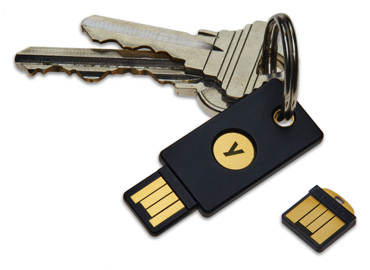
YubiKey: Two-factor authentication through a physical device that is plugged into a usb slot. For every service a public-private-key-pair is generated, the service only has access to the public key. Supports One-Time-Passwords where every new log-in uses another passcode and it is phishing resistant because key pairs are generated on base of domain (e.g. https://facbook.com is not valid due to missing e). By clicking on the “y”-button before logging in, it is verified that the user tries to authenticate with this device. That prevents man-in-the-middle attacks. Stolen YubiKeys can be disabled when using the YubiCloud-service.
Using alternative software
Secure services must be as easy to use as insecure services or users will tend to use insecure alternatives. We are used to great consumer products of big companies like Google or Apple but business solutions are often not that easy to work with, especially old systems. So employees could use simpler file sharing services (like Google Drive or Dropbox), private mail-services (Hillary’s mistake) and office software (like Google presentation). Thereby the uploaded data can be on servers of potential competitors.
Usability wins
Consumer software does not get successful when it is incredibly secure, it gets successful when customers like to use it. For Example WhatsApp and Facebook were without encryption for a long time and many people do not know how to securely send their mails, even when highly sensitive data is shared. Personally, I had this experience with a bank that sent account data without encrypting it (though we requested it) because the contact person was not that familiar with this “computer stuff”.
Typical errors and their solutions
Not always security depends on usability but there are some use cases where usability can be increased without unstabilizing the system.
Validation
Validation is important to prevent user from adding wrong input or execute sql injection and cross site scripting attacks. Backend validation is absolutely necessary for a reliable system, frontend validation should be used to show instant feedback. But it should not be too strict or imprecise.
Xi Wu wants to register with her real name though her fore- and lastname contain less than three characters. René and Søren want to use their special characters too. Just code relevant characters like < > & “ could inject attacks. Furthermore error messages should be precise and help inserting the input correctly. Hints like “input not valid” will not make users happy. And of course: DO NOT delete the form if one or more inputs are incorrect when using backend validation only.
To provide instant feedback, frontend validation is very pleasant for users. Thereby the location of the error is easier, the context of the input field is fresh in mind, it is less likely to unintentionally skip required fields, it satisfies the user (keyword gamification) and improves efficiency.
There are also some common errors when developing live inline validation. The error should not be shown when users write into the input the first time. The same applies to messages after the submit button has been pressed. Only when the field loses focus the first time a hint should be shown that fades out as soon as the input is correct.
Updates
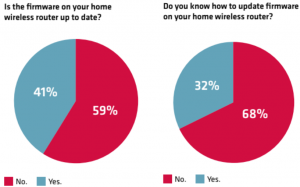
Updates are fundamental for security. New security breaches need to be fixed and deployed on every device, but most IoT-appliances and routers have no automatic update function. It needs to be done by the user itself which is rarely carried out.
Even IT-experts have problems to do these necessary actions privately:

Performance
Performance is one of the most crucial usability parameters but security can decline it. Especially encrypting large amounts of data is bad for runtime. A tradeoff should be made: Decide which impact the leak of data could have and use encryption just for critical information. When performance is bad users will tend to use insecure alternatives for every data.
Security Messages
They are ignored, they seem annoying but are very important. Before installing apps with access to sensible parts like camera, data system or microphone, the user should be aware of that, though he or she does not want to read the warnings. But the good thing is: Users can be manipulated to pay more attention to messages, thanks to neuroscience. Bonnie Anderson defines in a talk for security specialists three parameters that affect perception of such dialogs: Dual-task interference (DTI), Habituation and Generalisation.
Dual-task interference (DTI)
Users will ignore warnings when they are doing something “more important”. Brains have problems doing several tasks at one time. When showing a security message (like “browser detected unusual behaviour”, etc.) a suitable time slot should be used to maximize the user’s attention. Ideally before or after a task is done, for example during loading time or after a video is watched.
Habituation
The brain links a new visual input to an older, similar looking one, comparable to cache. When showing users same looking messages he or she is more likely to click them away or ignore them. When using different designs and animations, they are more likely to pay attention. Due to Bonnie Anderson’s studies even four alternating message designs or animations decline the ignoring rate.
Generalisation
Due to generalising between similar looking dialogs, a warning message should look different in comparison to an ordinary info message. Also frequent notifications decrease the attention to security messages.
Team structure and Management
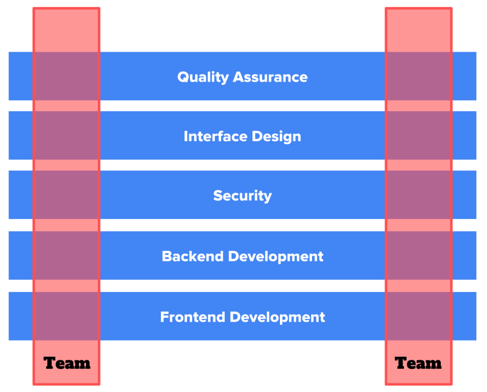
One of the most important and effective options to combine great usability and high security standards in software is communication. Cross functional teams where an usability specialists works in the same team as a security expert tend to much better harmony between these two IT areas than separating teams into special disciplines. The following image visualizes cross functional teams:
Another important point regarding management, is “security by design”. Security needs to be embedded into sprints in planning, design and implementation phases from beginning.
Final thoughts and research questions
Security and usability are both fundamentally important to develop great software and can even depend on each other, when users start to circumvent impractical safety guidelines. The tradeoff of these two subjects can be minimized when circumventing the shown errors, using alternatives and experts of both subjects work together. This does mean larger effort and costs but ends up in better, more successful software and secure digital company environments.
Build Bridges!
The fusion of these two areas is still not completed and there are some research questions for coming investigations:
Are there possibilities to simplify user interactions regarding security we do not know yet?
With studies examining user behaviour, creating personas, interviewing people and research in cognitive psychology entirely new possibilities could be possible.
Can we increase safety awareness in our society?
Should “behaving secure with software systems” be integrated to IT curricula in schools? And how do we teach people more efficiently to create such awareness?
Is it possible to make maximum secure systems without any limitations regarding usability?
Authorization and authentication processes still reduce usable system due to users must enter id and password. Can this step be simplified by using external hardware? Especially smartphones have great potential to be used as key for PC applications. Unfortunately it needs a lot of adaption to make this possibility common in IT world.
Can we make software management more effective using new methods?
Traditionally, software development, security and usability have been studied separately, and each has evolved special development processes. Few development cycles for one address the interests and concerns of the other two. In order to design truly usable and secure systems we must integrate these three disciplines and examine more efficient management methods.


Leave a Reply
You must be logged in to post a comment.