Introduction
Howdy, Geeks! Ever frustrated by public transportation around Stuttgart?
Managed to get up early just to find out your train to university or work is delayed… again?
Yeah, we all know that! We wondered if we could get around this issue by connecting our alarm clock to some algorithms. So we would never ever have to get up too early again.
Well, okay, we’re not quite there yet. But we started with getting some data and did some hardly trustworthy hypothesis of prediction on it. In the end it’s up to you if you gonna believe it or not.
To give you a short overview, here are the components that are involved in the process. You will find the components described in more details below.
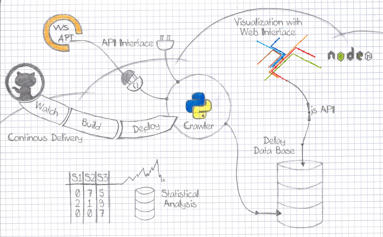
A view parts in short:
1. crawler and database – get and store departure information
2. visualization – visualizes the delays on a map
3. statistical analysis – some statistical analysis on the delays over a week
4. continuous delivery – keep the production system up to date with the code
Technology/Services
Ok, where to start? We need some highly available service to gather live data from the VVS API. VVS is the public transportation company in Stuttgart. Thankfully, their API serves information about delays.
Because we were able to work on this project in the class Software Development for Cloud Computing we got access to the IBM Bluemix cloud platform. This platform offers the deployment of lots of services and applications. A Python App is one of it. So, because we love and speak Python, why not use it for an API data crawler.
Crawling the data
This is where we got into contact with some cloud service the first time and yes, for someone who is used to be root (access to all and everything on a computer), this is going to be nasty. This is one of the things you have to learn quickly: Adapt your needs to the given environment. The cloud tries to help you to just deploy and use things out of the box. But this “convenience” comes with a lot of constraints and preconditions.
In this case what we wanted to have was a standalone worker that simply crawls data.
The crawler is supposed to call the VVS API every 5 min to get departure information for every S-Bahn station in and around Stuttgart. The answer of the API contains information about the planned and estimated departure times and whether it is real-time controlled or not. “Real-time controlled” means that there is live information about the train, including its (possible) delay. On top of that it serves messages about some events that impact the schedule, as well as detailed information about the train and station.
The crawler was coded from scratch. It builds a framework for integration of different APIs and unit tests. Currently, our tests cover the basic functionality, database connection, read and write checks and some sanity checks as well.
A cool feature of the cloud platform that we used, is the ability to have a Continuous Integration Pipeline.
The service monitors our GIT repository and pulls the code on any change, rebuilds and restarts the crawler.
Before we could get this all up and running we had to get around an issue, you might also run into.
What the cloud assumed was that we wanted to deploy a Web App that somehow serves a web interface.
The special thing about the web interface is that this is used to perform a health check.
This means the cloud platform does some “App is alive” check for you to restart it or inform you if it is not running anymore. So be aware how this check is done!
In our case it was like: no open web port, no passing health check. This caused the cloud to restart our crawler, which just wanted to crawl data without serving any web interface for e.g. live progress tracking.
To come around this we had to tell the cloud that it shall use the process status as a health check. Sounds easy, but it might be tricky to figure out where this option can be set. For us this could be done within the manifext.yml file, which defines some properties for the cloud platform. Notice the health-check-type parameter.
---
applications:
 - name: vvs-delay-crawler
   no-route: true
   memory: 128M
   health-check-type: process
Storing the data
Now that we’re able to retrieve data, what to do with it? Obviously it needs to be stored in some way, but: How? Quite a lot of time and thinking went into solving this question. Should we use a relational database or NoSQL? Should we store the data exactly in the form we get it or do we do some transformation beforehand? What data do we really need, what is redundant, what is superfluous?
Finally (or not so final, see later) we settled on the following:
NoSQL database
When we were considering a relational database, we actually could come up with data models that would have been able to depict our case. But: We just didn’t see how it would be efficient to first divide the single documents we get from the API into different relations, only to set them back together later on for further processing. We figured the SQL queries would become just too complicated – and unnecessary. Since we already have the data (kind of) in the form we’d like to use it – a JSON structure – we decided to stick to that.
Transform before storing
Saying that the data coming from the API already has the form we want it to have is not quite right. As can be seen in the screenshot below, it comes with a bunch of extra info that we are not interested in, or that we don’t know how to process with machine learning.
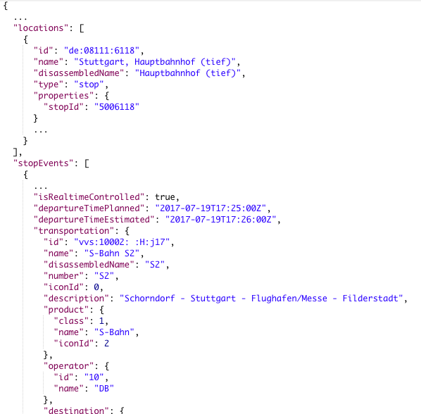
As an example, take the detailed description of the station: redundant names, IDs, types and so on. We don’t need all that, just a single number to identify the station is sufficient. And the document in the picture is already significantly shortened; the actual API result was originally 668 lines long.
Aside from the redundant stuff, there is also information that might be interesting for our case, even if we don’t know how to deal with it yet. For instance, in the case of severe service disruptions, often a message for the customers is added. It contains information about alternative routes or, important to us, the reason for the delay or disruption. These kinds of information are quite difficult to include in the machine learning process, however, we are certain that they can play a role. So, to avoid the regret later on, we do store them, just in case.
However, to use our storage space most effectively, we don’t just strip off the unneeded parts, but do a little more transformation before writing to the database. Especially in the first version, our data model was designed to need as little space as possible. For this purpose we did not use a proper “key”: “value” approach, but rather put the value directly into the key position, so to say.
Unfortunately we had to find out the hard way how impractical this is. The issue: Dealing with “unknown keys”. Well, we do know, say, the keys “S1” to “S60” for our respective lines, but it’s really not good style to use a switch statement or the like here. And when it comes to the IDs of the stations, such a workaround is almost impossible, given that there are 83 of them. Luckily, JavaScript and Python both offer functions to retrieve all keys of an object, so this wouldn’t be any problem here. Only the Cloudant query interface does not have such a functionality – at least we couldn’t find one. So it’s simply not possible to filter documents by nested values while ignoring the key in front. To give a practical example: You can’t retrieve only documents containing data of any S1-trains no matter at which station.
Further down the road we thus settled on another layout, “version 1.3”, which represents some kind of compromise. It still contains line numbers as keys, but everything else is properly structured following the “key”: “value” scheme. See below:
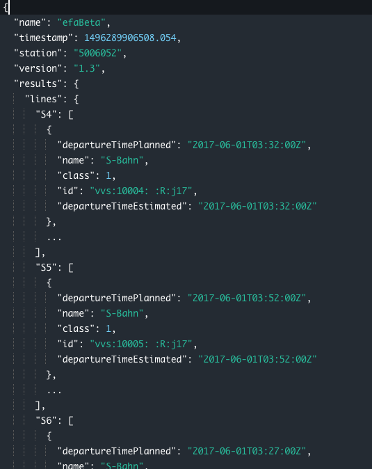
Thanks to our versioning, however, we are still able to change this layout in the future and adapt all APIs and functions to deal with new versions.
Accessing the data
When talking about “accessing” data we have to differ between
a) inspecting the database manually for development purposes
b) retrieving and processing data programmatically.
For a) the Cloudant DB offers a quite neat graphical web interface. The user can click themselves through IBM Bluemixcollections and documents, and even create, update or delete them. It includes the possibility to run queries, i.e. filters on the database to only show you matching documents. Sounds nice, but doesn’t work that well in practice. First of all, it takes a while to grow accustomed to the syntax, which is being complicated by the (can you guess?) incomplete documentation. Secondly, we had some trouble with a missing filter for fields nested below “any key”, as mentioned in section “Transform before storing”. Thirdly, if the amount of documents matching the query is very high, displaying the result either takes a loooot of time, or just doesn’t happen at all. And lastly, finding errors in your query is very hard, due to non-existent or incomprehensible error messages.
For b) there’s also a nice feature of IBM Bluemix which makes it easy to deal with permissions and all that jazz. If an app needs access to a database you can “connect” them via the web interface and the app is automatically authorized for CRUD operations (create, read, update, delete). No need to create new admin users for each app, to grant them the respective rights, copy-paste keys around etc. Well, actually you do have to create a set of credentials to be used, but that’s a one-click task. The best part is that there’s no need to maintain and get confused by various config files. The credentials are automatically stored in an environment variable “VCAP_SERVICES” of the connected app – and you can just lean back and watch cloud magic.
In addition to that, you can download these credentials and access the database from outside the cloud. We have to say, programmatically this worked really well. Meaning, opening a connection from a running program. We were able to develop locally, working on the cloud database (not the production one, of course) without much hassle. A simple check whether the environment variable is set and that’s about it.
But – and there’s always a “but” – manually, i.e. with Postman or in the browser, this didn’t work out. Maybe we just haven’t tried hard enough, but when we tried to retrieve documents from Cloudant’s REST API following the instructions from the documentation, we had no luck.
For this and other reasons (as described in the “Visualization” section), and because we thought it’d be a good opportunity to try out the “API Connect” feature of Bluemix, we decided to build our own REST API service for our database.
Up until now, said API has remained quite basic, though it can easily be extended in the future. It merely offers the route “GET /entries”, which, well, returns entries (documents) of the database. By the query parameters “startTime” and “endTime” (both UNIX timestamps in milliseconds), the user may delimit the requested timeframe. An additional parameter “filterEmpties” (boolean) does exactly that, and a last one “transform” (also boolean) governs whether the data should be returned in original form or should undergo further changes in structure first. These changes mainly include reordering of the documents from “per timestamp” to “per station”, which is important for visualization, and the addition of some minimal statistical info about the requested dataset, which has already helped discover some oddities within the crawled data.
The API service has been set up conceivably easily using a Node.js server and an API definition framework called “Swagger“. We didn’t get as far as integrating it with “API Connect”, however. Unfortunately, Bluemix and its buggy UI crossed our plans yet again and what seemed so simple in the docs just did. Not. Work. In reality. Rather than waste our time trying to find out why, we gave up in frustration after a few tries and settled for our own stand-alone API, which can be accessed here: [vvs-delay-db JSON API] (https://vvs-delay-api.eu-de.mybluemix.net/).
Ideas to go further
Ok, let us think a bit about how this could develop. Unfortunately we could not get a machine learning algorithm running on the data. But it would be predestined for one. Why? Because it could learn in an on-line fashion. We have real-time data, every 5 minutes a new training sample is generated by the crawler. So the learning algorithm could learn on and on. If you’re not to familiar with machine learning, don’t worry. Just keep in mind that awesome stuff can be done with it!
So why didn’t we implement it, if it’s that awesome? Machine learning needs a lot of resources during the training. To keep costs low a cloud service normally offers just a few things that has to do with machine learning therefore. This is a cool thing for any service which just wants to use a pre-trained model like image classification, where a given image shall be tagged with the things that are visible in it. If you have a custom thing to train and still want to do this in the cloud, like we do, you might need a (virtual) server with root access. You could set up your own environment then and build everything you need by your own. But this might get way more expensive.
Statistics
Before machine learning rules prediction systems, statistical approaches were means of choice. We were interested, how the delays are distributed over the week. So we started to count the delays for each 5 minutes interval of the week. By that, we mean an average delay value for each S-Bahn for the time slots 00:00-00:05, …, 14:00-14:05, 14:05-14:10, …, 23:50-23:55. With a lightweight web API the system can be asked about the average delays, e.g. on Monday morning 08:10-08:20.
Visualization
With our end goal in mind – an app that predicts train delays for sleepy students and hurried business people – there’s one thing that’s still very obviously missing: An intuitive representation of the data. Unfortunately, bunches of JSON documents resting in a cloud database are not enough. Also for us, during development, an easy-to-read overview of what the crawler is actually collecting would be great. Even more so, as the Cloudant DB interface is buggingly slow and the query options very limited.
What we would like to have is a nice visualization of our data. As long as we’re not able to make any predictions, at least we want to show past and current delays.
This sounds easier than it is. Because our data is that multi-dimensional, we’re not just done with an easy scatter plot or pie chart. We have:
1. Spatial information (the VVS net map)
2. Categorial information (different S-Bahn lines)
3. Temporal information I (the “current” time, meaning the time a data point refers to/was collected)
4. Temporal information II (minutes of delay)
More technically, we have thousands of documents looking like this:
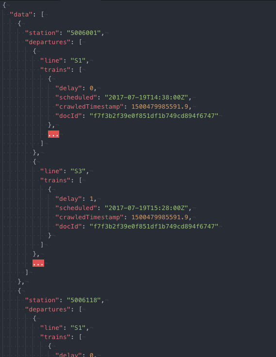
How can we display these in an optically pleasing and easily understandable way? For us, it came down to a representation of the VVS net grid with an overlay of the delay data. To reduce the temporal dimension, we chose to show delay averages of an adjustable interval. A similar form can be used to show the predicted delays at one point the future.
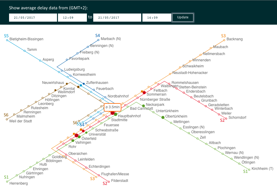
The technologies we used to implement this are HTML, SVG, CSS and JavaScript. In our opinion, a web User Interface (UI) is the most easily publicly accessible way. And with the library d3.js at hand we had the perfect tool to create a dynamic SVG graphic. For those who don’t know it yet, go take a look at some of the stunning plots made with d3.js: d3 Gallery. Enough reason to try it out, right?
And we have to say, with all the (exceptionally good) documentation, examples and tutorials available on the interwebs, working with d3.js was a piece of cake. You do have to get used to the declarative coding style and understand d3.js’s data binding concept first, but after that, it’s easy.
One problem however that we ran into was, again, our data model. d3.js is basically made to work with arrays of data. Of course it can handle nested objects as well (it’s JavaScipt, duh), but it’s a bit less straightforward.
So the struggle was to re-form our documents as they came from the API (see above) into something that could 1:1 be rendered into a graphic.
We achieved this by separating the static (stations and lines) from the dynamic data (the delays).
The array which we feed into d3.js to draw the top layer of delay information looks like this:
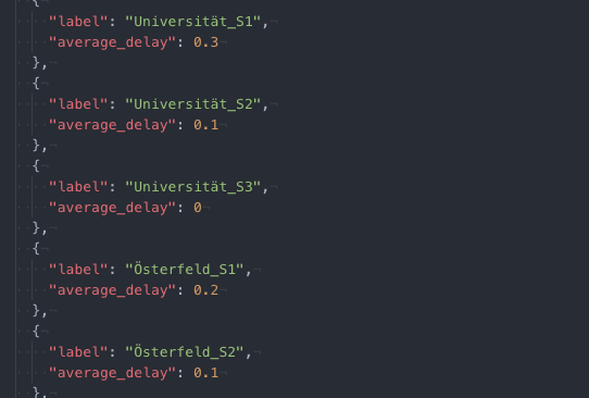
See how every data point contains the actual delay value? Many little transformation steps beforehand are necessary to reach this form, but it’s easier than using d3.js to iterate over the data and calculate it during rendering (if it’s even possible…). The “labels” resolve to coordinates stored in a separate JSON document. If you’re curious about the details, you can check out the code on GitHub.
A lot of time and thought also into the design of the map, and making it really dynamic and (somewhat) responsive. SVG is great, but you need to provide all the details, i.e. where and how things should be drawn. d3.js thankfully covers a lot of it: You can programmatically determine e.g. colors, sizes, even positions, dependent on the respective data. However, in our case, all of the 125 stations (counting stations serving multiple lines repeatedly) have unique positions on the grid, which cannot be calculated automatically.
To solve this, we didn’t puzzle all of them into the right position by hand, but used another little homemade JavaScript tool to retrieve the coordinates of all stations from the well-known VVS net map image. With the tool, you can click on one station after the other, enter its name, and the respective coordinates are stored automatically – absolute pixel positions as well as relative ones (for scaling). We realized that it’s not enough to draw stations with multiple lines as one point – the graphic just became confusing that way. What’s more, we also had to draw the lines connecting the stations, which we found to be kind of a hassle for various reasons. Looking around for alternatives, we found this graphic with a much simpler structure and SVG already! First we tried to parse its path data programmatically. We figured we could easily hijack the graphic and add our own elements in some way. Halfway down the road we realized that it does not quite match our present mapping from data points to SVG elements so we went back to retrieving the coordinates manually with the mentioned tool. Finally, the spatial data we got out of that round, we could use to render the net map including all 125 stations and 6 lines.
Now putting our delay data on top of that worked like a charm. We represent it with colored circles for each line at each station that grow in size and darken their shade relative to an increase of the average delay. White circles mean that there’s no data available – an issue that we are yet to resolve.
The graphic is interactive in that the viewer can choose the time interval to be displayed. Choosing a very short and very recent interval, you can get pretty close to a real-time rendering. Another limitation that we still need to fix is that it’s currently not possible to request data of an interval of more than 24 hours. There’s an incomprehensible problem with our JSON API service prohibiting this.
Other than that, the visualization service is open for use and ready to be extended for the depiction of future delay predictions.
Integration Pipeline/Deployment
When it comes to things you have to do over and over again, informatics are lazy. So they automate it. This is where the Integration Pipeline service comes in. It does several things for you:
1. Get code from the code source, e.g. GitHub
2. Edit the code if needed, e.g. config files
3. Compile code if needed
4. Deploy the application
Instead of getting the code to the servers manually, the service pulls it from a repository. The process gets triggered as soon as new code is available, so there is no need for a developer to do any action, besides pushing the code, once everything is set up.
We use different versions of the application. One in development state and one deploy or stable version. This results in two different configuration files on the server, normally. However, the cloud service can generate or adapt the config files for us, with respect to the different versions. So, the development version uses the development database and the deploy version, you guess it, the deploy database. Yeah, even more laziness!
Sometimes it is necessary to compile code, i.e. bring some program code to something a specific computer can understand. This depends mainly on the operating system and architecture of the used computer. This means, the code has to be translated on the cloud computers anyways. And this has to be done every time new code is available. Perfect job for the Integration Pipeline.
Finally, we want the newest application version running. And that’s something the integration service can achieve, too. After everything was pulled, altered and compiled the currently running application gets shut down and the new one starts up. Awesome!
The mentioned abilities are just a few. You can have multiple stages, with different tasks getting executed. It is like your personal little robot, doing all the nasty stuff for you, once you told him what is needed.
Lessons Learned
- know your environment
- debugging gets harder the farer the system is away (which is somehow the case for a cloud platform)
- use existing solutions if some is available. With individual code, you need individual platforms and that is going to be expensive
What’s next?
We achieved some cool visualization and the database is already filled with a lot of data. The code that was used for this project is available on GitHub.
- visuals: https://github.com/elisae/vvs-visuals
- the statistical approach: https://github.com/Bennri/vvs-delay-learning
- the crawler: https://github.com/jhertfe/vvs-delay
Furthermore, some machine learning would be nice and could increase the possible applications.

Leave a Reply
You must be logged in to post a comment.